Graham is Curio’s resident Person Who Knows Things. Besides being a dynamite creative in his own right, he’s exceptionally curious, and it is a genuine pleasure to hear him go off about the things he finds interesting.
In this edition of GraNerdCorn (trademark pending), Graham discusses the importance of clean design apropos the following question from Curio’s fictitious mailbag:
Dear Graham:
My business is in a field that involves a lot of specialized expertise, and I want a single graphic I can use for my website, social media, etc. that explains what we do. I’m thinking it could be an infographic with a lot of cool illustrations and written content, and lots of really bright colours and bold fonts so it really pops.
So… where are we at with that thing I just said?
Yours truly,
Sue Denim
Hi Sue!
We’d be happy to help, and I think it’s a great strategy to use graphics to translate complex knowledge. But before we get underway, we should talk about what graphic design strategies to use when trying to communicate a lot of info all at once.
The operative word here is “communicate.”
Graphic design differs from other kinds of art in that we are trying to clearly get across a specific message.
The main challenge of graphic design is to get that message across using as little content as possible. A successful design, to me, is one that the audience can digest in the shortest amount of time.
And often, simplification isn’t exactly simple—for instance, this video shows a time-lapse of my process for rendering the human brain as a single-line drawing.
Important to know: To whom are you talking?
If your audience contains more than one person, they will all have different priorities, predilections, and preconceptions. The more quickly you can help them understand what you want them to understand, the more people you can potentially reach.

I know—it sounds less like art and a bit more like math or social studies (and for that I am sorry). Some people might think the point of hiring a designer is to make things pretty, which is not wrong, per se. One of the best things about my work is that I get to nerd out over how to make a design as aesthetically-pleasing as possible.
Design and Decoration: Not really the same
Despite their similar goals, design and decoration are not the same things. To decorate is to add extra touches to a visual environment, but a good designer has to remove extra elements so that we can draw the viewer’s attention to the information they need.

This is where design gets a bit more arty—the designer makes a lot of different choices for colour, type, line, weight, contrast, and proximity, both to establish a hierarchy of important information and to create a unique visual experience for the viewer.
Plan to Succeed
So yes, we can absolutely design an infographic for you, and for sure, we can make it effective and informative and beautiful, but we need to be certain of a few things right off the jump:
- What are the most important things you want to get across to the viewer? Of all those things, which is the one that is most important of all? To think of it another way, if the viewer only understands or remembers one thing after seeing this infographic, what would it be? This will help us decide how and where to draw the viewer’s attention.
- What do we know about the audience? That is, who is this graphic meant to reach? How familiar are they with the subject matter? This will help us decide how much visible information we need to include (as well as what we might not need to include).
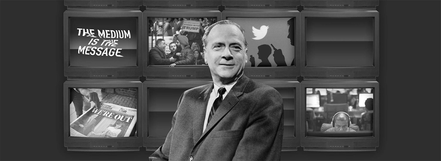
- Where is this graphic going to appear? Like McLuhan said: The medium is the something something somethingorother (I’m paraphrasing), so there’s a big difference as to whether the image will appear on a billboard, in an annual report, or on the side of a coffee mug. Knowing where a graphic is going to appear will help us decide the most important elements in the composition, as well as their relative weight and size.
This can be a lot to think about, but it’s definitely worthwhile to think about it beforehand. It’s even BETTER to get those thoughts, decisions, and background information written down beforehand.
SO, if you’re planning a major graphic design piece, check out our recent blog on writing a Creative Brief (which also features some handy links to Curio’s Creative Brief questionnaires).

Thanks for your message, and if you have any questions, let’s chat!
Your pal,
Graham.
Graham’s Nerd Corner is a production of the Children’s Graphic Design Workshop. Stay tuned to this blog for future dispatches from the Nerd Corner!
This post was last updated on March 10, 2024 by Matt Steringa