Graham is the resident Person Who Knows About Stuff and Things at Curio Studio. Besides being a dynamite creative in his own right, he’s got that special brand of curiosity usually reserved for toddlers who just learned the word “why.” And it is a genuine pleasure to hear him go off about the things he finds interesting.
Today we are pleased to kick off the first edition of Graham’s Nerd Corner with the following question from Curio’s (possibly fictitious) mailbag:
Dear Graham:
I recently asked Curio about a logo for my small business, and I noticed in the details of your quote that “all final artwork files developed are pixel perfect.”
My question for you is: Buh?
Yours,
Reed Actid
Hi Reed, thanks for your excellent question.
To make an image “pixel perfect” basically means creating a file from scratch that will always look as sharp as possible on a screen, regardless of which screen you’re looking at.
This has a lot to do with how digital images are created and how those images are later converted to different sizes and formats.
Digital Screens: 16 Million Points of Light
As any bored child with a magnifying glass will confirm, a digital screen is basically a grid made up of rows and columns of thousands of pixels (i.e. the smallest elements on a page that can be changed).
There are really only two ways to change a pixel, namely:
- You can change the colour of a pixel by choosing how much red, green, or blue light shows up (which is why you may have heard the term ‘RGB’ used to describe a colour appearing on a screen); AND
- You can change how brightly a particular pixel appears.
With just those two bits of information, a screen can produce over 16 million colours distinguishable to the human eye. Not too shabby.
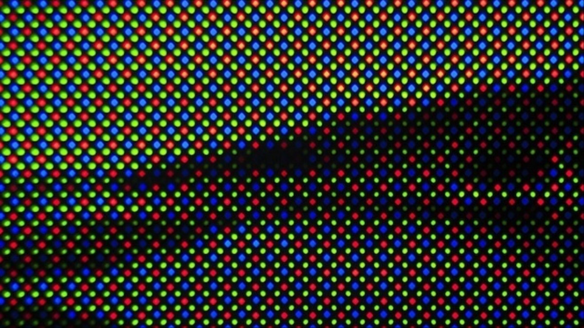
Author: Simon Pyle. Source: Vice.com
The Lowdown on High-Res
Like any grid, a screen is made up of tiny squares. When those squares are small enough, they can approximate a non-linear shape or a curve that you would NEVER guess was made up of squares.
If an image is made up of a LOT of very tiny squares, we call it a higher-resolution image.
If, however, it’s made up of a smaller number of BIGGER squares, we call that a lower-resolution image.
Sometimes we need to convert a higher-resolution image to low-resolution, which can be done in programs like Adobe Photoshop. When we do this, the program basically has to make a lot of educated guesses as to which colours to use in the bigger squares so that the new, low-resolution image will look as much like the high-res image as possible.

Similar challenges come up when we need to convert a vector image into a raster image.
Vector vs. Raster Images: Working for Scale
Most logos you’ve ever seen are created as vector images, which use a series of math equations to establish exactly where the different elements of an image appear relative to one another. Because those same equations apply no matter how big a vector image appears, they are called SCALABLE— that is, you can scale them to any size without losing image quality.
Pretty much every digital photo you’ve ever seen, though, would be called a raster image, which is non-scalable and will lose image quality every time you scale it up to a higher resolution or down to a lower resolution.

Source: justcreative.com
Pixel Perfect Images: Setting up for Success
So let’s say you have a logo that was created as a vector image so that it would look as pretty on a billboard as it does on a business card. Of COURSE you also want that logo to appear on your website, but, in order to make it look good without taking a long time to load, you convert the scalable (vector) image into a low-resolution (raster) image.
In order to make sure your logo consistently looks good no matter where it appears, your designer can choose in advance to make that logo image pixel perfect—that is, the designer can simplify the visual elements that make up the logo so that a digital device needs to do as little “guessing” as necessary when it renders the image.
each was created using whole numbers of pixels on a pixel grid.
So why does this matter?
As a designer, I consider it a big part of my job to get visual messages across as clearly and consistently as possible. Depending how an image is created, then however it’s manipulated thereafter, there’s a lot of opportunity for a message to get distorted, or blurry, or lost altogether.
Every image we create at Curio is our best attempt at transmitting a message from our clients to the audience they’re trying to reach. When we start by making an image pixel-perfect, we are working at the most atomic level of visual elements to make sure that message gets across as clearly as possible, regardless of where an image appears.
It’s also a way of controlling visual order on a microscopic level, which is just sweet bliss for someone who likes things to be “just so.”
Thanks for asking!
Your pal,
Graham
Graham’s Nerd Corner is a production of the Children’s Graphic Design Workshop. Stay tuned to this blog for future dispatches from the Nerd Corner!
This post was last updated on January 12, 2022 by Matt Steringa